You remember the good ol’ days, back when we had nice, working Tabs and Accodions in Classic SXA? It was fantastic! You could add and remove them easily and you could move a single tab or accordion panel around WITH it’s content. Oh, and you could SHARE them, fully configured, between pages. It was a beautiful sight to behold! And, it came OUT OF THE BOX! W00t!
But now, we’re in a headless world. You don’t get sh* hardly anything OOTB anymore… Don’t get me wrong, that’s not entirely a bad thing. But it does present it’s challenges. You have to write it yourself. To be quite honest, it’s really not even that big of a deal to recreate most of this yourself. There is one big caveat though. And it was a pain to hac… solve. The implementation that I’m about to describe isn’t perfect, but it works. 🙂
The Problem
There’s one major difference between the Classic MVC implementation of Tabs and Accordions versus what we can implement in Headless: Presentation Details. In Classic SXA, the presentation configuration of what content went in what placeholder was all stored at the datasource level – on the datasource item itself. That was made possible by a little thing called Pipelines that could run on both the CM and the CD. When the component was being rendered on the server side, if it came accross one of these components, it would run an additional pipeline to combine the presentation details stored on the datasource item with the presentation details from the page. It worked a treat!
But in headless, we don’t have that luxury. In other words, we must store the configuration of what content goes in what placeholder on the Page instead of the datasource. The main downside to this is that, if you try to move panels/tabs around in the panel/tab container, the content of that panel/tab will not move with the panel/tab. The panel/tab header will move, but not the content of that panel/tab. This is the biggest problem. I’m sure there’s some fancy, hipster way of accomplishing the same goal with middleware, extra calls to the layout service, etc…, but since I’m not a real hipster (I just play one on TV), I just relied on my old, .net, server-side ingenuity inge-hackery to get it accomplished.
The My Solution
I’ll start with the Accordion, as that’s a bit more straightforward of an example. To begin, I created some templates. An Accordionthat will be the parent datasource, an AccordionPanelthat will be the child items representing each panel in the Accordion, and an Accordion Folder that would be the folder to hold shared accordions in the /Data folder. We’ll see later why this template probably isn’t even worth creating, but more on that later.
The Accordion doesn’t have any fields and the Accordion Panel has the fields shown above. **Hint: the AccordionIndex should probably forshadow the “magic sauce” that makes this whole thing work…
In my case, I also created a branch template that, when creating the Accordion, it pre-creates all of the possible Accordion Panel children and populates the AccordionIndex field appropriately.
I do this because, when creating components that use Dynamic Placeholders, you have to pre-create a Placeholder Settings item for each possible dynamic placeholder that your component might use. IMO, this kinda defeats the purpose of “dynamic placeholders”, but I suppose that’s an argument to be had over drinks at the bar during Symposium or SUGCON. 😀 Anyway, I limited the max number of accordion panels to 10. If you have an accordion that needs more than 10 panels, you should probably re-think how you’re displaying your content. But I digress… I pre-create all of these items mostly so I don’t have to deal with the “out-of-range” scenarios when working with the Accordion in Experience Editor. We just pre-create them all, then deal with hiding empty placeholders on the front end. 🙂
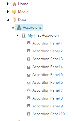
After I’ve created the templates and the branch template, I go ahead and create my first Accorion datasource.
After that, let’s create those Placeholder Settings items I mentioned earlier. Pay special attention to the Placeholder Key field value accordion-0 – that will play a significant role shortly.
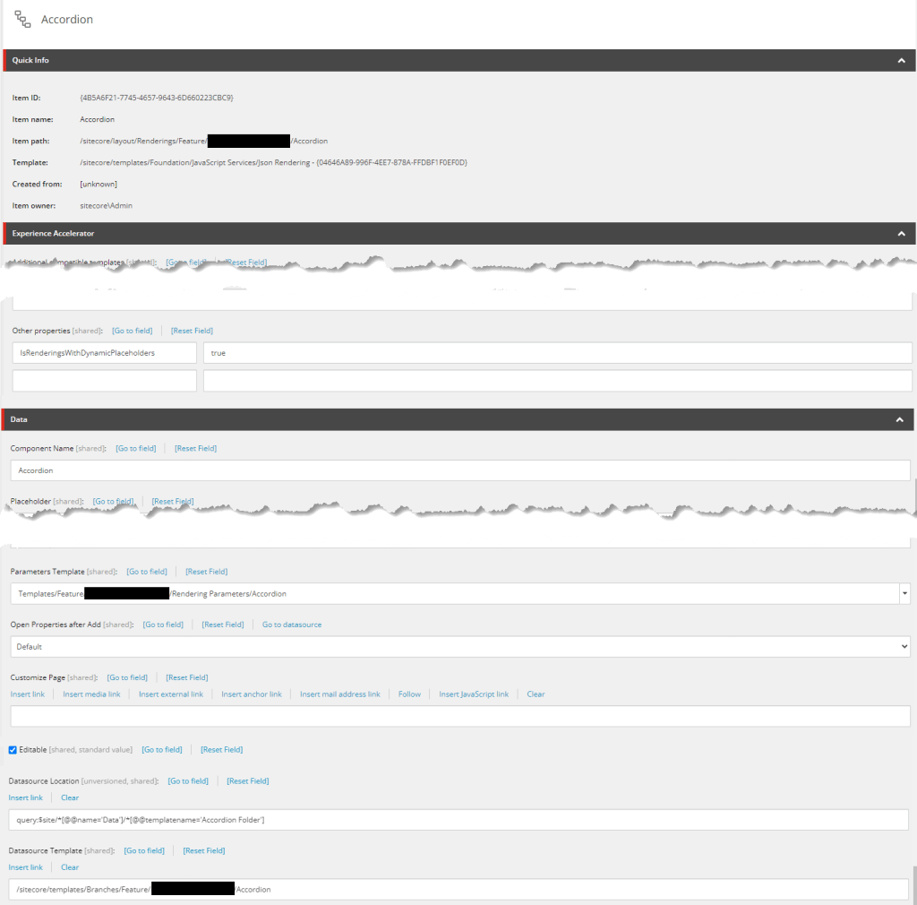
Next up, let’s create the rendering:
This is just the basic parts of the rendering. Two of the most important parts are further down. First, the GraphQL query:
query Accordion($datasource: String!, $language: String!) {
  datasource: item(path: $datasource, language: $language) {
    accordionPanels:children(includeTemplateIDs:["{42EF29D7-BD33-47C6-B47C-C19B035E29D6}"]) {
      results {
        ...on AccordionPanel {
          id,
          path,
	  accordionHeading { value },
          accordionIndex { numberValue }
        }
      }
    }
  }
}
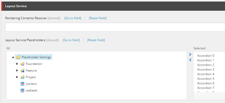
Lastly, remember when I said you needed to pre-create Placeholder Settings items for each possibly “Dynamic” Placeholder you might possibly use? Well, this is why:
You need to select them all in the Layout Service Placeholders field. Otherwise, it just won’t work and you’ll bang your head against the wall for days, wondering WTF isn’t this working as it should??? That happened to a friend…
I won’t walk you through it here, but you’ll also need to create the Headless Variant items for the Accordion and you’ll need to add the Accordion rendering to the Available Renderings section of your site.
Now, finally, the NextJS code. I created an Accordion.tsx and an AccordionPanel.tsx file.
In Accordion.tsx, I start by creating the TypeScript interfaces that match the structure of the GraphQL returned from the Layout Service, and the “props” type.
interface AccordionPanel {
   id: string;
   path: string;
   accordionHeading: {
      value: string;
   }
   accordionIndex: {
      numberValue: number;
   }
}

interface Fields {
   data: {
      datasource: {
         accordionPanels: {
            results: AccordionPanel[];
         }
      }
   }
}

type AccordionProps = {
   rendering: ComponentRendering & { params: ComponentParams };
   params: { [key: string]: string };
   fields: Fields;
};
Then I create the markup for the Accordion itself – the main container for the Accordion Panels.
export const Accordion = (props: AccordionProps): JSX.Element => {
   const id = props.params.RenderingIdentifier;

   return (
      <div className={`component accordion ${props.params.styles} ${props.params.HideEmptyPanels ? 'hide-empty-panels' : ''}`}
           id={id ? id : undefined}>
         <div className="component-content">
            <ul className="items">
               {props.fields.data.datasource.accordionPanels.results.map((panel, index) => {
                  return (
                     <AccordionPanel key={index}
                        rendering={props.rendering}
                        index={index}
                        accordionPanelId={panel.id}
                        accordionHeading={panel.accordionHeading.value}
                        accordionIndex={panel.accordionIndex.numberValue}
                        params={props.params} />
                  )
               })}
            </ul>
         </div>
      </div>
   );
};
Finally, let’s create the AccordionPanel.tsx file. We start by defining the Edit Frame buttons we’ll use in Experience Editor.
const editFrameButtons = [
   {
      header: 'Edit Accordion Header',
      icon: '/~/icon/Office/16x16/font.png',
      fields: ['accordionHeading'],
      tooltip: 'Edit the Accordion Header'
   },
   {
      header: 'WebEditButton',
      icon: '/~/icon/Office/16x16/navigate_up.png',
      click: 'item:moveup',
      tooltip: 'Move the Accordion Panel up',
   },
   {
      header: 'WebEditButton',
      icon: '/~/icon/Office/16x16/navigate_down.png',
      click: 'item:movedown',
      tooltip: 'Move the Accordion Panel down',
   }
];
Then we define the “props” that get passed in.
type AccordionPanelProps = {
   rendering: ComponentRendering & { params: ComponentParams };
   index: number;
   accordionPanelId: string;
   accordionHeading: string;
   accordionIndex: number;
   params: { [key: string]: string };
};
Lastly, the markup itself.
const Panel = ({ accordionHeading, accordionPanelId, accordionIndex, params, rendering, isPanelOpen, togglePanelOpen }:
   AccordionPanelProps & { isPanelOpen: boolean; togglePanelOpen: () => void }): JSX.Element => {
   return (
      <li className={`item accordion-item-panel panel-${accordionPanelId} ${isPanelOpen ? 'active' : ''}`}>
         <div className="toggle-header" tabIndex={parseInt(params.DynamicPlaceholderId)}
            onClick={togglePanelOpen}>
            <div className="label">
               <div className="row">
                  <div className="component content col-12">
                     <div className="component-content">
                        <div className="field-heading">{accordionHeading}</div>
                     </div>
                  </div>
               </div>
            </div>
         </div>
         <div className={`toggle-content ${isPanelOpen ? 'panelOpen' : ''}`} >
            <div className="row">
               <Placeholder name={`accordion-${accordionIndex}`} rendering={rendering} />
            </div>
         </div>
      </li>
   );
}

export const AccordionPanel = (props: AccordionPanelProps): JSX.Element => {
   const { sitecoreContext } = useSitecoreContext();
   const [isPanelOpen, setIsPanelOpen] = React.useState(sitecoreContext.pageEditing ? true : false);

   const togglePanelOpen = () => {
      if (!sitecoreContext.pageEditing) {
         setIsPanelOpen((prev) => !prev);
      }
   };

   if (sitecoreContext.pageEditing) {
      return (
         // @ts-expect-error - EditFrame is not fully typed
         <EditFrame key={props.index} {...getEditFrameProps(editFrameButtons, props.accordionPanelId, 'Accordion Panel')}>
            <Panel {...props} isPanelOpen={isPanelOpen} togglePanelOpen={togglePanelOpen} />
         </EditFrame>
      );
   } else {
      const slideKey = `accordion-${props.accordionIndex}`
      if ((props.rendering.placeholders as PlaceholdersData)[slideKey].length > 0) {
         return (
            <Panel {...props} isPanelOpen={isPanelOpen} togglePanelOpen={togglePanelOpen} />
         );
      }
      else {
         return <></>
      }
   }
};
First, we define the Panel itself that display the content. Most of it is all boilerplate stuff, but THIS line is the magic sauce that was foretold long ago:
<Placeholder name={`accordion-${props.accordionIndex}`} rendering={props.rendering} />The accordionIndex property is the value from the AccordionIndex field on our Accordion Panel item. Remember this one?

Remember, way at the start of this article we talked about the fact that, in our Headless implementation, the configuration of which content went in which placeholder was stored on the page, not on the datasource (in this case, the Accordion)? And that resulted in an inability to move panels/tabs around easily WITH their content? Well, this field is what makes it possible in my solution.
You see, in our GraphQL query, we’re getting a list of child Accordion Panel items. Then we simply loop through them in our props.fields.data.datasource.accordionPanels.results.map((panel, index) statement in Accordion.tsx. So the order of the children is the order in which the Accordion Panels are displayed. This method also allows us, quite easily, to use the built-in “move-up/move-down” functions provided by sitecore to re-order Accordion Panels. Storing this index value on the Accordion Panel child item and using that field value in the name of the Placeholder allows the Accordion Panel AND it’s content to move up and down as a unit.
The last part of the markup for AccordionPanel deals with showing (or not) the Edit Frame if you’re in Experience Editor, as well as hiding empty, pre-created panels that didn’t ever get content assigned.
But wait, some of you old-school Sitecore devs that made it this far may be thinking to yourself, “But Taco, you’re storing values related to presentation along side the content itself. That’s a big no-no!”

But in this world of “headless” and my just-above-basic understanding of NextJS, This is How I Did It (TIHIDI).
Next time on TIHIDI, I’ll discuss how I implemented Tabs. It’s pretty close to this implementation of Accordion, but different enough to warrant it’s own article since this one is WAY past TL;DR;.
Feel free to poke holes all over this article if you like, but comments are moderated. So…comment away! 😀
Happy Sitecore trails, my friends!


